Table of Contents
When I first started designing websites, I noticed that a lot of businesses don’t really get why an easy-to-use site matters. Web Design Fundamentals are the backbone of how users perceive and interact with your online presence.
Without them, even the most beautifully branded website can fail to engage visitors or convert them into clients.
I’ve seen how using these basics can turn a messy website into something that’s easy to use. Added to that, it looks professional and actually works. Every business, big or small, gets better results when it understands and applies these main rules.
Understanding Web Design with Easy-to-See Examples
Web design is all about how a website looks and how people use it. Web development is more about coding behind the scenes. But web design focuses on what users see and do.
Important things in web designing include the layout, colors, fonts, pictures, and making the site easy and fun to use.
From my experience, let me share an example of two websites for a coffee shop. One has random conflicting colors, inconsistent fonts, and hard-to-read menus.
The other uses a minimalist layout, harmonious colors, readable text, and clear navigation. So you have guessed it already; the second site immediately feels professional and inviting, even before tasting the coffee.
For some real-world examples, you can check out our portfolio of modern website designs.
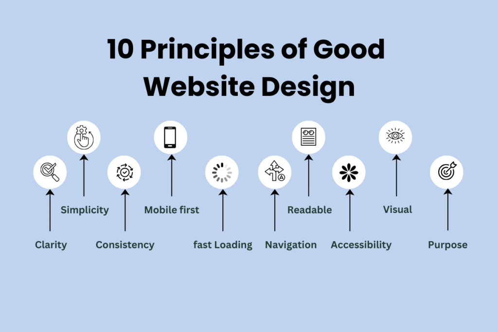
10 Principles of Good Website Design

I’ve been in web design long enough to see the same patterns over and over. A business comes to me saying, “People aren’t staying on our site,” or “Nobody clicks the button.”
Nine times out of ten, it’s because one of these principles was ignored. On the flip side, I’ve also seen sites transform completely just by applying them.
Here’s what I’ve learned:
Clarity First
Ever landed on a site and had no clue what they actually do? Maybe there’s a huge image of a mountain, a vague slogan like “Reaching New Heights,” and… nothing else.
That’s a clarity problem. When visitors have to guess, they leave. I make sure the main headline and visuals answer the big question instantly: Who are you and what can you do for me?
Simplicity Wins
I’ve seen websites where every inch of space is packed with banners, pop-ups, and animations, like walking into a shop where 10 salespeople shout at you at once.
People just leave. Strip away the noise, and suddenly, visitors start clicking where you actually want them to.
Consistency Across Pages
Have you ever clicked from one page to another and felt like you landed on a totally different site? It happens when your website has been designed inconsistently.
If you want your visitors to stick to your site, you need a consistent design throughout all of the single webpages.
Mobile-First Thinking
We are not in 2001 right now. Most of us browse on our phones, yet I still see sites that clearly started on desktop and got “squeezed down” for mobile.
That’s why you should design mobile-first. In an interview, Mark Zuckerberg mentioned that if he were designing Facebook now, he would make it a mobile app first, not a website.
When you design mobile-first, it feels natural no matter what screen size you’re on, and visitors stay longer.
Fast Loading
Suppose your website is taking a few seconds longer to load than your competitors. People will leave even if your site has the best content.
I once worked with a client whose gorgeous homepage took 12 seconds to load. After optimizing images and code, it dropped to 3 seconds, and their bounce rate fell by almost half.
Easy Navigation
Ever been on a site where you just can’t find the menu? Or worse, it’s hidden under three different dropdowns? That’s a conversion killer.
I keep menus clean, clear, and predictable. The fewer people who think about where to click, the more they explore.
Readable Content
I can’t tell you how many beautiful websites ruin themselves with tiny, light-grey text on a white background. If people can’t read your words, they can’t engage.
I stick to fonts and sizes that feel comfortable, with enough space so your eyes can breathe.
Accessibility for Everyone
Accessibility is basic good manners. I’ve had clients thank me because someone with low vision could finally navigate their site.
Conversely, I have seen many websites that don’t have accessibility settings. This is not the best decision.
Visual Hierarchy
Without hierarchy, everything looks equally important. That means nothing stands out. But by doing this, you will lose visitors and potential customers.
I’ve seen product pages where the “Buy Now” button blends right into the background. This is not helping your cause.
Purpose-Driven Design
If each of your webpages doesn’t have a specific purpose, it isn’t viable to add more generic pages just for the sake of it.
I’ve seen about pages that look nice but leave you wondering, “So… now what?” So you should design with intent. If the page is there to sell, it sells; if it’s there to inform, it informs.
Good website design is a mix of empathy and discipline. When you get these principles right, visitors will take action. And that’s what it’s all about.
Web Design vs. Web Development? Here’s How They Differ
I have seen many clients initially confuse web design with web development. Yet, they are different in many ways.
Design is the primary factor in retaining users, even though both are necessary. Web development works for the functionality of the website. And web design is more concerned with how users perceive your brand and navigate the site.
For Quick Reference:
| Web Design | Web Development |
| What it is: How the website looks and feels | What it is: How the website functions |
| Focus: Focuses on visuals, layout, colors, fonts, and overall style | Focus: Focuses on coding, databases, and server-side operations |
| Tools used: Figma, Adobe XD, Canva | Tools/Programming languages used: HTML, CSS, JavaScript, PHP, CMS platforms |
| Goal: Make it visually appealing and user-friendly | Goal: Make it fast, secure, and functional |
| Example: Choosing a color palette that builds trust | Example: Writing code that makes the contact form work |
From what I’ve seen, businesses that skip these web design fundamentals and head straight into development often end up with a technically working site. But that site is just technically working, nothing else. No one likes using it.
If you start with design, you’ve got a clear plan for development. Developers know what to build and how it should work. That kind of alignment can turn a “meh” site into one people actually want to bookmark.
Why Web Design Fundamentals Impact Your Business
The application of web design fundamentals has an impact on many things. It has an impact on SEO, brand perception, and conversion rates. A website with good web design fundamentals woven into it will be ranked better than one without those basics.
You know this even if I don’t mention it; people tend to trust websites that look professional and are easy to use. When a site feels simple and reliable, visitors stick around and come back. On the opposite, confusing sites usually drive people away.
I’ve seen it way too often: a business launches a polished new website. Then they spend big on ads, and… nothing. Traffic shows up, but leads? Not so much. The owner might think that the problem is actually related to marketing. But most of the time, the issue is related to web design.
Web design isn’t just about looking good. It’s about creating trust. Keeping people exploring. Getting them to act. It all starts with the basics:
- Clear navigation so people don’t get lost
- Mobile-friendly layouts that actually work on smaller screens
- Fast load times so visitors and search engines like it
- Consistent branding so your site feels professional and trustworthy
For a poorly designed website, people bounce before they even see what you offer.
From my own projects, I’ve noticed that when a client invests in solid design from the start, they see a noticeable bump in engagement metrics. The policy here is so simple: good design builds trust, and trust drives sales.
How We Design Websites: From Basics to a Fully Working Site
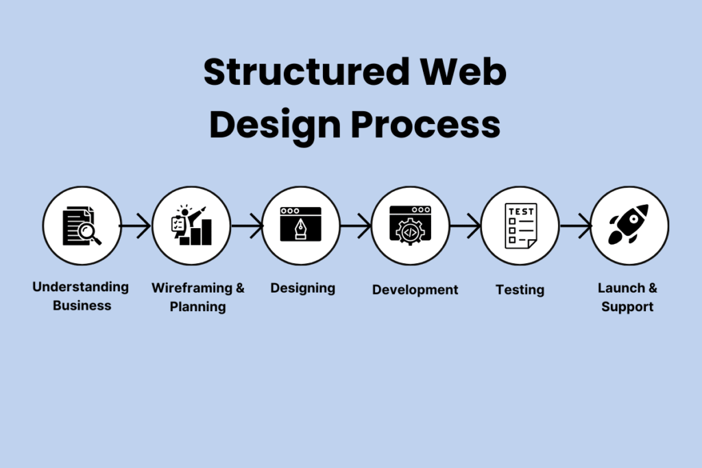
At my agency, we follow a structured process to ensure every website meets these principles:

Understanding Your Business
Before a single pixel is designed, I spend time learning what your business does. Our research team explores who your customers are and what your goals look like.
This helps me figure out the tone, style, and structure your site needs.
Wireframing & Planning
Think of this as the blueprint. I map out where everything goes, navigation menus, call-to-action buttons, and content blocks. So the user’s journey feels natural and effortless.
I have designed hundreds of websites for different niches. So I have that experience, knowing the optimal design practices.
Designing the Look & Feel
At this stage, we work with the overall look of your website. My team will now decide on the colors, typography, and visuals of your site. Normally, I keep it clean and consistent across your entire site.
At the same time, I will also make sure everything is on-brand so your website doesn’t just look good, it feels like you.
Development & Functionality
At this point, we will talk with you about the design. Once the design is approved, our team brings it to life with code.
Whether it’s WordPress, WooCommerce, or a custom build, I make sure everything runs smoothly across devices and browsers.
Testing & Refining
When everything is ready, it is time to launch. However, before launch, my team checks the site from top to bottom. Every link, form, page, and button gets tested. If anything breaks or feels off, we fix it right away.
Launch & Support
When everything’s ready, we go live. But I don’t just disappear, I stick around to make sure your site is performing and help with any updates you need.
Our goal is to make sure your site looks good while being properly functional from top to bottom.
Examples of Effective Web Design
I find examples really help clients get it. On a recent digital marketing project, we cleaned up the layout, used comfy colors, and made the menu easy to use. Engagement went up 35%.
Another example is an e-commerce site where consistent typography and intuitive navigation doubled checkout completions.
For a local restaurant, we made sure the site worked great on phones and added clear buttons for reservations. In just a month, online bookings jumped 50%.
If you want to see more examples like these, check out our portfolio.
Common Web Design Mistakes to Avoid
I’ve seen plenty of websites that look impressive at first glance. But they fail miserably when it comes to actually guiding visitors or making sales. A good-looking site is useless if it frustrates people or hides important information.
That’s why I keep a list of the biggest web design mistakes to avoid. Fixing them can instantly make a site more usable and effective.
Cluttered Layouts
The first mistake some beginners make is cramming the page with too much stuff. Yes, you are doing it so that you can share all the information at once. However, it is not user-friendly at all.
Your website’s layout should be clean and well-structured. So don’t make this mistake of building a cluttered website.
Ignoring Mobile Users
Over half of the internet is scrolling on a phone right now. Still, many website owners don’t design their site with a responsive theme.
Don’t make the mobile-friendly design an afterthought. Rather, it is always better to build for mobile from the start.
Slow Load Times
Even you wouldn’t like our website if it were slow. Because of that, you should keep files light, scripts tidy, and hosting solid so everything shows up in a blink. Otherwise, you will lose visitors to your competitors who are offering fast websites.
Weak Navigation
When you are visiting a website for the first time, it should be familiar to you. You should be able to navigate through the site with ease.
If the visitors are confused about where to click, they’re not going to stay here for a long time. So, I always advise keeping menus simple and easy to follow.
Autoplay Media
Loud videos or music that start playing on their own? Hard pass. People start to look for the mute buttons as soon as possible when this happens. It also slows down your website’s loading time.
Poor Contrast & Hard-to-Read Text
Content is the king when it comes to blogging. So your website’s content should be clean and easy to read. Don’t go for the fancy look while compromising the user-friendliness.
You might find that pale gray text on a white background fancy. We are not disagreeing. But if you can’t read it, what’s the point? So, avoid this mistake of adding hard-to-read text on your site.
Vague Call-to-Action (CTA)
All websites have a goal for their visitors. Some want to create an email list, whereas some want to sell their products. Whether it’s “Buy Now,” “Get a Quote,” or “Sign Me Up,” you should make sure the next step is obvious so nobody’s left wondering what to do.
Stock Photos Overload
Generic stock photos scream, “I grabbed this in five seconds.” I’d rather use real brand photos or custom graphics that actually feel like you.
Forgetting About Accessibility
Not everyone experiences your site the same way. I design so anyone can navigate it, from adding alt text to making sure colors work for people with vision differences.
Inconsistent Branding
Switching fonts, colors, or tone from page to page makes a site feel stitched together from scraps. I keep it consistent so every page feels like part of the same story.
FAQs on Web Design Fundamentals
Here’s a quick FAQ to clear up some of the most common questions about web design fundamentals.
What are the fundamentals of design?
They include layout, typography, color, navigation, accessibility, and user-centric design.
What are the 5 golden rules of web design?
Keep it simple, maintain consistency, ensure readability, prioritize UX, and optimize for mobile.
What are the 7 fundamental principles of design?
Balance, contrast, hierarchy, alignment, proximity, repetition, and simplicity
What are the basics of web design for beginners?
Focus on clean layouts, clear typography, color harmony, navigation simplicity, and responsive design.
Do I need coding for web design?
Not necessarily; tools like Figma, Adobe XD, and WordPress allow design without deep coding knowledge.
What skills are required for web design?
Visual design, UX/UI principles, typography, color theory, wireframing, and prototyping.


